
Two bulbs can share the same brightness and the same warm-white tone yet make a room look completely different. One makes skin look healthy and food look fresh; the other makes both look slightly gray and flat. The difference usually comes down to a specification most shoppers never notice: the color rendering index, or CRI. It measures something color temperature cannot, and once you learn to read it, you start to see its effect everywhere.
What CRI actually measures
Color rendering index describes how accurately a light source reveals the true colors of the objects it illuminates, compared with a reference light such as daylight or a traditional incandescent bulb. It is expressed on a scale up to 100. A bulb with a CRI of 100 renders colors as faithfully as that reference; a bulb with a CRI of 70 renders them noticeably less faithfully, muting and distorting certain hues.
The key idea is that white light is a blend of many wavelengths, and not every white bulb contains a balanced mix. A light can look convincingly white to the eye while being deficient in particular parts of the spectrum. When an object that relies on those missing wavelengths is lit, its color cannot be reflected properly, so it appears dull or shifted. CRI is an attempt to put a single number on how complete that spectrum is.
Why CRI is not the same as color temperature
People often confuse CRI with color temperature, but they answer different questions. Color temperature, measured in kelvin, tells you whether a light looks warm and yellowish or cool and bluish. CRI tells you how truthfully that light reveals the colors of everything it touches. The two are independent: you can have a warm 2700-kelvin bulb with excellent color rendering, or a warm 2700-kelvin bulb with poor rendering, and they will look quite different even though a meter would report the same warmth.
This is why relying on color temperature alone can lead to disappointment. Someone might choose a warm bulb to make a living room feel cozy, only to find that fabrics and wood tones look muddy. The warmth was correct; the rendering was not. Understanding both numbers together is what lets you predict how a space will really look before you buy.
The red problem hidden inside the average
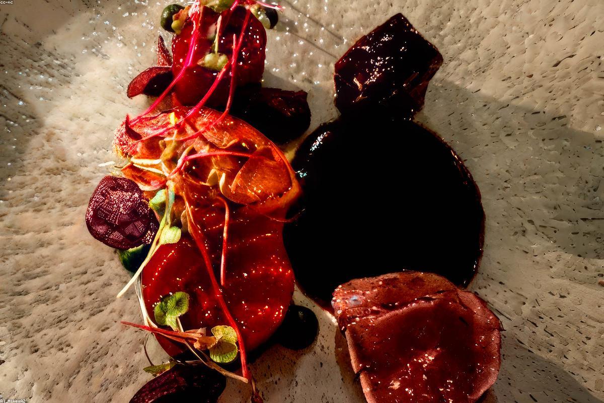
CRI is calculated as an average across a set of test colors, and averages can hide weaknesses. One test color in particular, a strong, saturated red often referred to as R9, is left out of the most basic CRI calculation, yet it matters enormously for how natural a room feels. Reds appear in skin tones, wood, food, and countless furnishings. A bulb can post a respectable overall CRI while rendering deep reds poorly, which is why some lights make people look pale or make raw meat look unappetizing.
For that reason, buyers who care about accurate color, such as those lighting a kitchen, a bathroom mirror, or a space where they photograph products, look beyond the headline CRI number to the R9 value when it is published. A high overall CRI paired with a strong R9 score is the mark of a genuinely well-balanced light.
Where high CRI is worth paying for
CRI does not matter equally in every room, and part of choosing well is knowing where accuracy earns its keep. In spaces devoted to appearance and detail, the difference is dramatic:
- Bathroom mirrors, where poor rendering makes it hard to judge skin tone and apply makeup accurately.
- Kitchens, where color tells you whether produce is ripe and meat is properly cooked.
- Closets and dressing areas, where you need to match clothing colors that will later be seen in daylight.
- Art walls, display shelves, and anywhere textiles, wood, or paint colors are meant to be appreciated.
- Home studios and workspaces where photos or video are captured and color fidelity affects the result.
In these rooms, moving from a mediocre bulb to a high-CRI one is one of the most noticeable upgrades available, often more striking than a change in brightness. Skin looks alive, wood grain regains its warmth, and colors that once looked washed out become saturated and true.
Where a lower CRI is perfectly acceptable
Not every fixture deserves a premium bulb. In a garage, a utility closet, a mechanical room, or an outdoor security light, the goal is simply to see clearly, and the exact fidelity of colors is unimportant. A functional bulb with a modest CRI does the job at lower cost. Understanding this keeps a lighting budget sensible: spend on rendering where the eye is judging color, and economize where the light is purely practical.
There is also a small tradeoff to be aware of. Historically, pushing CRI higher could come at a slight cost to efficiency, because filling in the missing parts of the spectrum sometimes meant sacrificing a little brightness per watt. Modern bulbs have narrowed that gap considerably, but it explains why the very highest-CRI bulbs occasionally list slightly lower lumens for the same wattage. For the rooms where color matters, that small efficiency cost is almost always worth paying.
Finding the number and using it
CRI is usually printed on the bulb packaging, often near the color temperature and lumen figures, and it may appear as a plain number such as 80, 90, or 95, sometimes labeled as a minimum. As a general guide, a CRI in the low 80s is ordinary and acceptable for casual spaces, the high 80s to low 90s is a clear step up suitable for living areas, and the mid 90s and above is excellent and reserved for spaces where color truly counts.
The practical habit is to decide what a room is for before you shop. If people will judge how things look in that room, treat CRI as a primary specification alongside brightness and color temperature, and favor a value of 90 or higher, ideally with a strong R9 score. If the room is purely functional, let CRI take a back seat. Make that distinction, and every bulb you buy will match the job it is asked to do, which is the whole point of paying attention to the number in the first place.